

2024年最新の有効なTDS-C01テスト解答とTableau試験PDF問題を試そう
無料Tableau TDS-C01試験問題と解答トレーニングを提供していますPassTest
質問 # 135
True or False: We can disaggregate the data, to see all of the marks in the view at the most detailed level of granularity
- A. True
- B. False
正解:A
解説:
Whenever you add a measure to your view, an aggregation is applied to that measure by default. This default is controlled by the Aggregate Measures setting in the Analysis menu.
If you decide you want to see all of the marks in the view at the most detailed level of granularity, you can disaggregate the view. Disaggregating your data means that Tableau will display a separate mark for every data value in every row of your data source.
To disaggregate all measures in the view:
Clear the Analysis >Aggregate Measures option. If it is already selected, click Aggregate Measures once to deselect it.
質問 # 136
Which of the following 2 columns CANNOT be deleted in Tableau?
- A. Measure Names
- B. Measure Values
- C. Calculated Fields
- D. Number of Records
正解:A、B
解説:
Measure names and values CANNOT be deleted in Tableau like other columns can. These are auto-generated.
Calculated Fields, and Number of records can both be deleted.
質問 # 137
True or False: Physical tables remain distinct (normalized), not merged in the data source whereas logical tables are merged into a single, flat table.
- A. False
- B. True
正解:A
解説:
In fact, the opposite of this is true.
Trick : Whenever you think of joins -> Think that after the join is created, we get 1 single flat combined (joined) table. This flat combined table is created prior to us creating our visualizations. This happens at the physical layer.
If you ever think about relationships, know that all tables will remain distinct and separate, and relationships sit at the logical layer. At run time, when you bring in the dimensions and measures to create your viz, Tableau very smartly creates the necessary joins, relates the tables and sends queries to these tables to get the resultant data back in the most meaningful way possible. This allows you to focus on using your data and revealing insights from it and focus less on the data preparation aspect!
Refer to logical layer vs physical layer from the official
documentation: https://help.tableau.com/current/server/en-us/datasource_datamodel.htm
質問 # 138
Using the CoffeeChain table, create a crosstab showing the Total Expenses per State and add Column Grand Totals to the view. Now group the states of New York, California and Washington. What percent of the total sales does this group contribute?
- A. 29.49%
- B. 23.39%
- C. 25.79%
- D. 27.73%
正解:D
解説:
We need to use the concept of Groups for this question. Follow along:
1) First, Drag State to the Rows shelf, and Total Expenses to the Text Mark on the Marks Shelf:
2) Now, remove the SUM aggregation from Total Expenses, and add a quick table calculation -> Percent of total:
3) Next, Select the States of New York, California and Washington -> And then click the paperclip icon:
We can see the answer already : 23.386% in the view above (even before grouping!)
4) Finally, we get the following view and our answer:
質問 # 139
Which of the following are the options to export the data used to build the view / visualisations?
- A. CSV file
- B. MS Access Database
- C. PDF File
- D. JSON format
正解:A、B
解説:
You can export the data in a Tableau data source, including all or part of the records from your original data. Alternatively, you can export only the portion of data used to generate the view.
Since the question mentions the data used to build the view, we'll focus on that :
*Export data in the view to Microsoft Access or .csv*
Export the data that is used to generate the view as an Access database (Windows only) or .csv file (Mac only).
1) In Tableau Desktop, select Worksheet > Export > Data.
2) Select a location and type a name for your Access database or .csv file.
3) Click Save.
4) If you're on Windows, the Export Data to Access dialog box displays to give you the option to immediately use the new Access database and continue working in Access without interrupting your work flow.
質問 # 140
Which of the following are stored in a .tds file? Choose 3.
- A. Calculated Fields
- B. Visualizations
- C. Data Connection information
- D. Metadata edits
- E. Data Extracts
正解:A、C、D
解説:
If you've created a data connection that you might want to use with other workbooks or share with colleagues, you can export (save) the data source to a file. You might want to do this also if you've added joined tables, default properties, or custom fields-such as groups, sets, calculated fields, and binned fields-to the Data pane.
Visualisations and Data extracts are NOT saved in a .tds file!
質問 # 141
You can use the __________________ in Tableau to clean / organise your data.
- A. Data manager
- B. Data organiser
- C. Data cleaner
- D. Data interpreter
正解:D
解説:
Explanation
When you track data in Excel spreadsheets, you create them with the human interface in mind. To make your spreadsheets easy to read, you might include things like titles, stacked headers, notes, maybe empty rows and columns to add white space, and you probably have multiple tabs of data too.
When you want to analyze this data in Tableau, these aesthetically pleasing attributes make it very difficult for Tableau to interpret your data. That's where Data Interpreter can help.
質問 # 142
True or False: A reference line cannot be added from the Analytics Pane
- A. False
- B. True
正解:A
解説:
You can add a reference line to any continuous axis in the view.
To add a reference line:
Drag Reference Line from the Analytics pane into the view. Tableau shows the possible destinations. The range of choices varies depending on the type of item and the current view.
In a simple case, the drop target area offers three options:
質問 # 143
Which of the following is NOT a valid official data source in Tableau Desktop?
- A. PostgreSQL
- B. SAP HANA
- C. Amazon Redshift
- D. Google Firebase
正解:D
解説:
Presently, there is no official way to connect your data in Firebase directly with Tableau Desktop.
A workaround however can be to export your Firebase data into Google BigQuery, and then connect it to Tableau Desktop.
But then again, it is a workaround and not an official out-of-the-box solution.
The following are the available Data sources available as of now:
1) Server
2) File
質問 # 144
True or False: To concatenate fields, they must be of same data type
- A. True
- B. False
正解:A
解説:
Yes! To concatenate fields, they must be of same data type. However, there is a workaround which we can use
- Type casting. See below:
Here, State and City are Strings, but Postal Code? Nope. It's an Integer. So we can simply use the STR() function to convert it into a String, and hence the entire equation becomes valid!
質問 # 145
Which of the following returns the Absolute Value of a given number?
- A. FLOOR(Number)
- B. ABS(Number)
- C. ZN(Number)
- D. CEILING(Number)
正解:B
解説:
From the official Tableau website:


質問 # 146
Create a Set containing Customer Names whose Sales are GREATER than 30,000. Which customer had the LEAST sales in this set?
- A. Tom Ashbrook
- B. Tamara Chand
- C. Penelope Sewall
- D. Sanjit Engle
正解:C
解説:
As the question mentions, we need to create a SET with the following conditions -> Choose only those customers whose Sales > 30,000
1) Right click on customer name --> Create --> Set
2) Let's Name the Set - Customer>30k ( you can name it anything you want :) ) Select USE ALL, and then move to the CONDITION TAB:
3) In the Condition Tab, Choose BY FIELD -> Select Sales -> Sum -> Greater than 30000 , and click OK
4) You should now have a new Set in the Data Pane as follows:
5) Drag this set to the rows shelf, and click on SHOW MEMBERS IN SET. Now drag Sales to the Column Shelf.
6) Click on the Show Mark Labels, and Sort ascending icons as shown:
7) Voila! We have our answer:
質問 # 147
What are two correct methods to change the data type of a field? Choose two.
- A. From the Data pane, click on the drop-down menu of the field.
- B. From the Data pane, select and hold the field.
- C. From the Data Source tab, click the data type icon of the field.
- D. From the Data Source tab, click on the drop-down menu of the field.
正解:C、D
解説:
you can change the data type of a field from the Data Source tab by clicking on the drop-down menu of the field or by clicking the data type icon of the field. You cannot change the data type of a field from the Data pane or by selecting and holding the field.
質問 # 148
Which of the following is a benefit of using a Tableau Data Source (.tds)?
- A. To hold one or more worksheets, plus zero or more dashboards and stories.
- B. To create a local copy of a subset or entire data set that you can use to share data with others, when you need to work offline, and improve performance.
- C. To not contain the actual data but rather the information necessary to connect to the actual data as well as any modifications you've made on top of the actual data such as changing default properties, creating calculated fields etc
- D. To create a single zip file that contains a workbook along with any supporting local file data and background images. This is great for sharing your work with others who don't have access to the original data.
正解:C
解説:
Explanation
The following are the official definitions from the Tableau documentation for the various file types:
1) .tds (Tableau Data Source) - To not contain the actual data but rather the information necessary to connect to the actual data as well as any modifications you've made on top of the actual data such as changing default properties, creating calculated fields etc. (CORRECT ANSWER)
2) .twbx ( Tableau packaged workbook) - To create a single zip file that contains a workbook along with any supporting local file data and background images. This is great for sharing your work with others who don't have access to the original data.
3) Extract (.hyper or .tde) - To create a local copy of a subset or entire data set that you can use to share data with others, when you need to work offline, and improve performance.
3) (.twb) Workbooks - To hold one or more worksheets, plus zero or more dashboards and stories.
質問 # 149
While borders and background colors let you visually highlight items on a dashboard, _________ lets you precisely space items.
- A. tiling
- B. spacing
- C. padding
- D. margining
正解:C
解説:
Padding lets you precisely space items on dashboard, while borders and background colors let you visually highlight them. Inner padding sets the spacing between item contents and the perimeter of the border and background color; outer padding provides additional spacing beyond the border and background color.
質問 # 150
Which of the following are benefits of combining sheets using dashboards?
- A. Provides the ability to use one sheet as a filter for other
- B. Helps in faster analysis
- C. It is mandatory to combine sheets when using Tableau
- D. Easier to compare visualisations side by side
正解:A、B、D
解説:
The only incorrect option is - It is mandatory to combine sheets when using Tableau.
All others are valid advantages that Dashboards provide when using Tableau!
質問 # 151
You have the following legend.
What occurs when you click the icon to the right of Air Ticketing Cabin Type Name?
- A. The highlighter toggles on or off.
- B. The Edit Colors dialog box opens
- C. The legend toggles on or off.
- D. The filter options open.
正解:A
解説:
When you click the icon to the right of Air Ticketing Cabin Type Name, the highlighter toggles on or off. The highlighter is a feature that allows you to highlight marks in the view that match a specific value or condition.
You can access the highlighter by clicking the icon next to a dimension or measure in the legend, filter, or parameter. The icon looks like a light bulb with a plus sign. When you click the icon, a highlighter box will appear where you can enter or select a value to highlight. The marks that match the value will be highlighted in the view, while the others will be dimmed. You can also use the highlighter box to search for values, clear the highlighting, or lock the highlighting. To turn off the highlighter, you can click the icon again or close the highlighter box. The other options are not correct descriptions of what occurs when you click the icon to the right of Air Ticketing Cabin Type Name. The filter options do not open, because the icon is not for filtering, but for highlighting. The legend does not toggle on or off, because the icon is not for showing or hiding the legend, but for accessing the highlighter. The Edit Colors dialog box does not open, because the icon is not for changing the colors of marks, but for highlighting them.
質問 # 152
Which of the following are valid ways to add Totals to a view?
- A. Using the Analytics Pane
- B. From the Analysis Tab in the Menu bar on top
- C. Using the Marks shelf
- D. Using the Data Pane
正解:A、B
解説:
To add totals to a view using the Analytics pane:
Also, you can add totals from the Analytics tab in the Menu above:
質問 # 153
Which of the following would you use to connect to multiple tables in a single data source at once?
- A. A Hierarchy
- B. A Set
- C. A Blend
- D. A Join
正解:D
解説:
The data that you analyze in Tableau is often made up of a collection of tables that are related by specific fields (that is, columns). Joining is a method for combining data on based on those common fields. The result of combining data using a join is a virtual table that is typically extended horizontally by adding columns of data.
For example, consider the following two tables originating from a single data source:
We can combine these 2 tables, simply by joining the tables on ID to answer questions like, "How much was paid in royalties for authors from a given publisher?". By combining tables using a join, you can view and use related data from different tables in your analysis.
質問 # 154
If you have a dashboard and are displaying its filter, how can you rearrange it?
- A. By clicking on the dropdown and dragging the filter
- B. By clicking anywhere inside the filter and dragging it.
- C. By clicking on the 2 lines on top and dragging the filter.
- D. By clicking on the filter title and dragging it.
正解:C
解説:
You can drag the filter by clicking on the 2 lines on top, and then dragging the filter as shown:
質問 # 155
Broadly speaking, after an importing a dataset in Tableau Desktop, all fields in it are broken down into
_______________________
- A. Numbers and Headers
- B. Labels and Values
- C. Dimensions and Measures
- D. Rows and Columns
正解:C
解説:
When you connect to a new data source, Tableau assigns each field in the data source as dimension or measure in the Data pane, depending on the type of data the field contains. You use these fields to build views of your data.
Further,
質問 # 156
Using the Time Series table, create a chart that shows the percent difference in Average Inventory on Hand for each Assortment by year and quarter.
How many quarters did the Electronics Assortment show a negative percent difference in the Average Inventory On Hand?
- A. 0
- B. 1
- C. 2
- D. 3
正解:A
解説:
If you chose 2, then you were very close but probably didn't plot the actual Percent Difference on your view. ( One of the marks is just over the line).
* Firstly, Drop the Week ID onto the column shelf, and convert it to continuous since we need both Year and Quarter as mentioned in the question.
* 2) Next, Drop assortment to filters shelf so that we can focus on Electronics!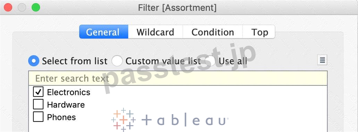
3) This should be your view now. Click on the Show Mark Labels icon as shown:
The final view is as follows, with 3 points below 0 ( i.e negative )
質問 # 157
In Tree maps, the size begins with the largest rectangle on the ________________ and the smallest rectangle on the ________________.
- A. top right, bottom left
- B. top right, bottom right
- C. top left, bottom right
- D. top left bottom left
正解:C
解説:
Explanation
Tree maps size begins from maximum in top left to smallest in bottom right.
See below to learn how to create a TreeMap and add colours to it:
質問 # 158
Suppose you have a bar chart. When we group by labels in a view, which of the following happens?
- A. Nothing changes in the view, but a group is created in the Dimensions shelf.
- B. The colours of the members selected are now the same, and different for the rest of the members.
- C. Trick question! It is not possible to group by labels.
- D. A new mark (bar) is created, which consolidates all members of the group.
正解:D
解説:
Explanation
*Very important question*
If we select the labels in the view and then group, a new consolidated mark is created - in our case bar since we are talking about a bar chart in the question. See below:
Then on grouping, a new bar is created, and the colour of all bars remain the same.
Had we grouped by choosing the marks instead of the labels, the following would be the result:
質問 # 159
......
Tableau TDS-C01認定試験は、36の複数選択の質問で構成されるコンピューターベースのテストです。試験の期間は120分で、合格スコアは70%です。この試験では、Tableau Desktopの基本、データ接続、計算、視覚化、ダッシュボードの作成など、幅広いトピックをカバーしています。質問は、候補者がTableauデスクトップを操作し、ソフトウェアを使用してさまざまなタスクを実行する能力をテストするように設計されています。
トップクラスTableau TDS-C01オンライン問題集:https://www.passtest.jp/Tableau/TDS-C01-shiken.html
TDS-C01練習問題集で検証済みのPassTest更新された315問題あります:https://drive.google.com/open?id=1VP-3Szhd5Urx2F4Z5Yo2o8jjom1ID0_9