

あなたを余裕でTDS-C01試験合格させます!100%試験高合格率保証 [2024]
TDS-C01問題集本日限定!無料アクセスが可能に!fromPassTest
質問 # 62
Using the dataset, create a bar chart showing the average Quantity broken down by Region, and filtered by Country to only show Japan. What was the average Quantity in the State of Tokyo?
- A. 3.500
- B. 3.000
- C. 3.704
- D. 3.840
正解:C
解説:
Since we need to focus on 1 country -> Japan, let's filter on it first as follows:
1) Drag Country to the filter shelf, and choose only Japan. Click OK.
2) Read the Question Carefully, we need to break down the visualisation by Region, then by Country, and then by State. So let's do that:
Drag Region to the column shelf, followed by Country. Drill down into Country to include states as well.
Then drag Quantity to the Row Shelf, and change the Aggregation to AVERAGE.
The following is our visualisation:
Now that you think of it, EVEN IF YOU REMOVE THE REGION, THE ANSWER REMAINS THE SAME. Such elements will be present in the actual exam too, just to make the question sound a little difficult, but actually it is pretty straightforward :)
質問 # 63
True or False: It is not possible to blend axes for multiple measures into a single axis
- A. True
- B. False
正解:B
解説:
We can very much blend multiple measures into a single axis. Such charts are called Combined-Axis / Blended-Axis charts. Follow along:
Measures can share a single axis so that all the marks are shown in a single pane. To blend multiple measures, drag one measure or axis and drop it onto an existing axis.
Instead of adding rows and columns to the view, when you blend measures there is a single row or column and all of the values for each measure is shown along one continuous axis. For example, the view below shows quarterly sales and profit on a shared axis.
Note: If you drag a measure on to the canvas and only see a single ruler indicator instead of the double ruler indicator shown below, Tableau creates dual axes instead of a blended axis. For more information about how to create dual axes, see Compare two measures using dual axes.
質問 # 64
Which of the following are the options to export the data used to build the view / visualisations?
- A. JSON format
- B. MS Access Database
- C. PDF File
- D. CSV file
正解:B
解説:
You can export the data in a Tableau data source, including all or part of the records from your original data. Alternatively, you can export only the portion of data used to generate the view.
Since the question mentions the data used to build the view, we'll focus on that :
*Export data in the view to Microsoft Access or .csv*
Export the data that is used to generate the view as an Access database (Windows only) or .csv file (Mac only).
1) In Tableau Desktop, select Worksheet > Export > Data.
2) Select a location and type a name for your Access database or .csv file.
3) Click Save.
4) If you're on Windows, the Export Data to Access dialog box displays to give you the option to immediately use the new Access database and continue working in Access without interrupting your work flow.
質問 # 65
Is it possible to deploy a URL action on a dashboard object to open a Web Page within a dashboard rather than opening the system's web browser?
- A. YES, we can do this with the help of a Web-Page object
- B. YES, we can do this with the help of Tableau Public
- C. YES, we can do this with the help of a plugin
- D. NO, this is not currently possible in Tableau
正解:A
解説:
To interactively display information from the web INSIDE a dashboard, you can use a URL action with a web page object.
For example, you might have a dashboard that shows profits by country. In addition to showing the profit data in your dashboard, you also want to display supplemental information about the countries from a web site.


質問 # 66
With the Marks card drop-down menu set to Automatic, a line chart will be created whenever you place what on the Rows shelf and the Columns shelf?
- A. Zero or more measures on one shelf, and 2 or more dimensions on the other
- B. Zero or more dimensions on one shelf, and 2 or more measures on the other
- C. Measures on one shelf, and a date dimension on the other
- D. A date dimension followed by a continuous measure on one shelf
正解:C
解説:
According to the Tableau Desktop Specialist Exam Readiness, a line chart will be created whenever you place measures on one shelf, and a date dimension on the other. This is because Tableau automatically recognizes date fields and treats them as continuous dimensions.
質問 # 67
Is it possible to make a Measure discrete?
- A. No
- B. Yes
正解:B
解説:
Of course! Follow along:
Right click on any measure, and choose Discrete as shown:
Once you do this, the green pill becomes blue in colour, indicating that it is now Discrete!
質問 # 68
Larger image
What is this view referred to as in Tableau?
- A. Dimensions & Measures
- B. Window Pane
- C. Analytics Pane
- D. Data Pane
正解:D
解説:
Tableau displays data source connections and data fields for the workbook in the Data pane on the left side of the workspace.
The Data pane includes:
Dimension fields - Fields that contain qualitative values (such as names, dates, or geographical data). You can use dimensions to categorize, segment, and reveal the details in your data. Dimensions affect the level of detail in the view. Examples of dimensions include dates, customer names, and customer segments.
Measure fields - Fields that contain numeric, quantitative values can be measured. You can apply calculations to them and aggregate them. When you drag a measure into the view, Tableau applies an aggregation to that measure (by default). Examples of measures: sales, profit, number of employees, temperature, frequency.
For more information on what dimensions and measures are, see Dimensions and Measures, Blue and Green.
Calculated fields - If your underlying data doesn't include all of the fields you need to answer your questions, you can create new fields in Tableau using calculations and then save them as part of your data source. These fields are called calculated fields.
For more information on calculated fields, see Create Custom Fields with Calculations.
Sets - Subsets of data that you define. Sets are custom fields based on existing dimensions and criteria that you specify. For more information, see Create Sets.
Named sets from an MS Analysis Services server or from a Teradata OLAP connector also appear in Tableau in this area of the Data pane. You can interact with these named sets in the same way you interact with other custom sets in Tableau.
Parameters - Values that can be used as placeholders in formulas, or replace constant values in calculated fields and filters. For more information, see Create Parameters.
質問 # 69
Which of the following URL prefixes are permitted when creating a URL Action in Tableau?
- A. SMTP
- B. HTTPS
- C. FTP
- D. HTTP
正解:B、C、D
解説:
A URL action is a hyperlink that points to a web page, file, or other web-based resource outside of Tableau. You can use URL actions to create an email or link to additional information about your data. To customize links based on your data, you can automatically enter field values as parameters in URLs.


質問 # 70
_______________ enables us to create workbooks and views, dashboards, and data sources in Tableau Desktop, and then publish this content to our own server.
- A. Tableau Server
- B. Tableau Prep
- C. Tableau myServer
- D. Tableau Public
正解:A
解説:
Tableau SERVER enables us to create workbooks and views, dashboards, and data sources in Tableau Desktop, and then publish this content to our own server.
Moreover, as a Tableau Server administrator you will control who has access to server content to help protect sensitive data. Administrators can set user permissions on projects, workbooks, views, and data sources.
質問 # 71
Which of the following is NOT a valid official data source in Tableau Desktop?
- A. Amazon Redshift
- B. SAP HANA
- C. Google Firebase
- D. PostgreSQL
正解:C
質問 # 72
How does Tableau know at which level to aggregate values?
- A. Aggregation is always done by using Tableau special formulas
- B. Tableau doesn't aggregate values, we do!
- C. Values are always aggregated at the level of the Date Part
- D. Values are always aggregated at the level of granularity of the worksheet.
正解:D
解説:
In Tableau, you can aggregate measures or dimensions, though it is more common to aggregate measures.
Whenever you add a measure to your view, an aggregation is applied to that measure by default. The type of aggregation applied varies depending on the context of the view.
When you add a measure to the view, Tableau automatically aggregates its values. Sum, average, and median are common aggregations; for a complete list, see List of Predefined Aggregations in Tableau.
The current aggregation appears as part of the measure's name in the view. For example, Sales becomes SUM(Sales). Every measure has a default aggregation which is set by Tableau when you connect to a data source. You can view or change the default aggregation for a measure-see Set the Default Aggregation for a Measure.
You can change the aggregation for a measure in the view from its context menu:
質問 # 73
DOWNLOAD THE DATASET FROM:
https://drive.google.com/drive/folders/1WXzqsrNmXVdmQ-574wld4InEplyKT8RP?usp=sharing (if you haven't already) Using the cwurData table, plot a Map to see which country had the Second highest number of patents in the Year 2013?
- A. Canada
- B. France
- C. United States
- D. United Kingdom
正解:B
解説:
Follow along to get the correct answer:
* Drag Country to the view, and then Patents to the Size Mark on the Marks shelf as follows :
2) But, this isn't all right? We need to focus on the year 2013. This can be done by using the year column as it is (continuous) in the filter shelf, or by converting it to discrete first and then using it:
2.1 As it is (continuous)
2.2 Converting to discrete first & then using it
and then :
3) We can now see that France, with 485 has the 2nd most number of patents for the year 2013
質問 # 74
Our use case states that we need to create a set showing the Bottom 10 products by Profit in each Region.
Which of the following filter types should you apply on Region?
- A. Context Filters
- B. Dimension Filters
- C. Extract Filters
- D. Measure Filters
正解:A
解説:
The beauty of context filters is that according to Tableau's Order of Operations, they are executed before Sets.
Diagram Description automatically generated
This means that based on what Region's you've selected - Tableau will first only preserve the rows for those Regions. THEN, after this it will compute the Set , i.e , Bottom 10 products in each Region.
1) First let's create a set to compute the Bottom 10 Products by Profit.
2) Next, take region on the Rows Shelf followed by the Set we just created. Drag Region and the Set to the Filters Shelf as well.
3) Now, try to only visualize the data for the South Region:
4) The problem right now is that Tableau is computing the Set first (Bottom 10 Products), and then applying the Dimension Filter - South Region and hence these values are incorrect. Note how these aren't even 10 products, but rather just 8. To fix this, simply add Region to Context:
Upon doing this, we get the correct answer as :
References: https://help.tableau.com/current/pro/desktop/en-us/order_of_operations.htm
https://help.tableau.com/current/pro/desktop/en-us/filtering_context.htm
質問 # 75
True or False: A LEFT JOIN or INNER JOIN creates a row each time the join criteria is satisfied, which can result in duplicate rows. One way to avoid this is to use data blending instead.
- A. False
- B. True
正解:B
解説:
Joins combine tables by adding more columns of data across similar row structures. This can cause data loss or duplication if tables are at different levels of detail, and joined data sources must be fixed before analysis can begin.
Inner join
Left Join
Blends, unlike relationships or joins, never truly combine the data. Instead, blends query each data source independently, the results are aggregated to the appropriate level, then the results are presented visually together in the view.
質問 # 76
Using the dataset, plot a Map showing all the countries, filtered by Market to only include LATAM. Which country in the LATAM Market has the highest shipping delay (sum of total number of days between the order date and the ship date)?
- A. Brazil
- B. Mexico
- C. Argentina
- D. Peru
正解:B
解説:
VERY IMPORTANT QUESTION FOR THE EXAM, PAY ATTENTION
1) To find the number of days between order date and shipping date, we will make use of a calculated field:
In the data pane, click on the dropdown arrow, and choose create calculated field.
Let's name this calculated field "ShippingDelay" (you can name it anything you want :) )
2) Use the DATEDIFF() function, and pass it the arguments as follows:
'day' depicts that we want to calculate the number of DAYS between the two dates. The first argument is 'start_date' which is the ORDER_DATE (day the order was placed), the second argument is 'end_date', which is the SHIP_DATE (date the order was shipped). So by subtracting as follows: SHIP_DATE - ORDER_DATE, we can find the delay in shipping.
Click OK.
3) You should now have a new measure as follows:
4) Phew! The hard part is done! Now let's filter by Market to include only LATAM: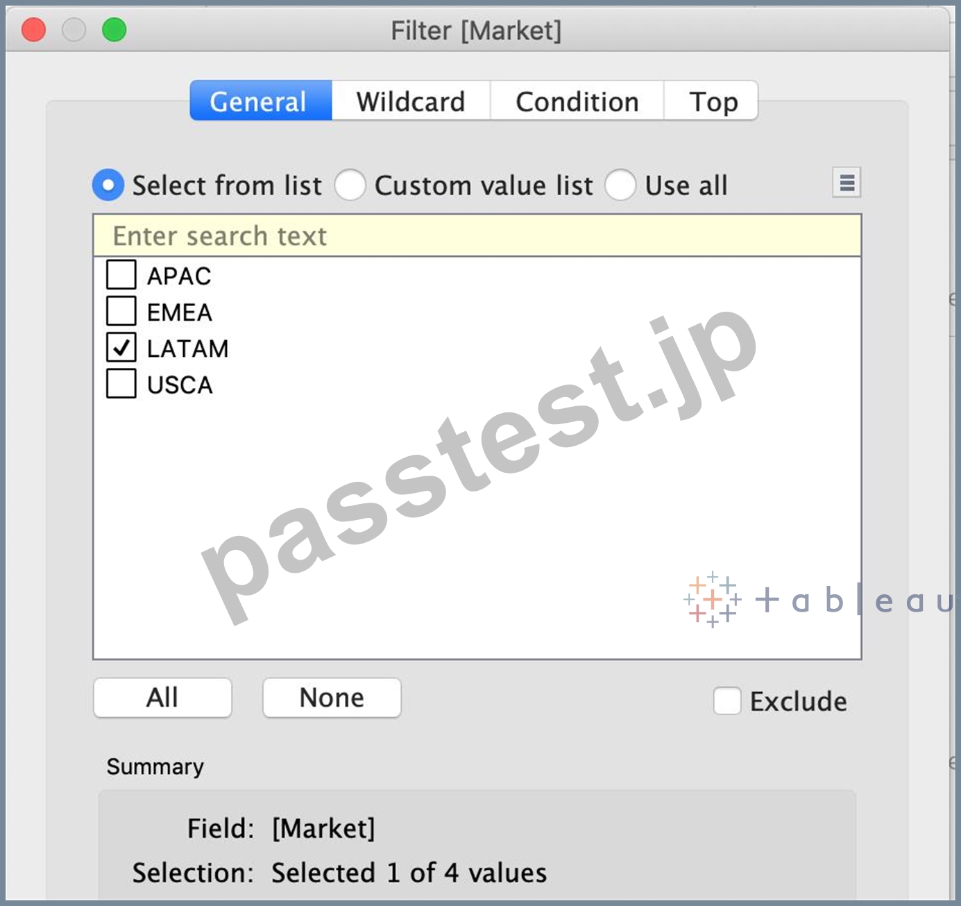
5) Drag Country to the view, and the new calculated field 'ShippingDelay' to SIZE on the Marks Shelf as follows:
*You can also click on Show Text Labels to be sure that you're choosing the Largest value*
Clearly, Mexico has the highest Shipping Delay!
質問 # 77
You have the following legend.
What occurs when you click the icon to the right of Air Ticketing Cabin Type Name?
- A. The legend toggles on or off.
- B. The highlighter toggles on or off.
- C. The Edit Colors dialog box opens
- D. The filter options open.
正解:B
解説:
When you click the icon to the right of Air Ticketing Cabin Type Name, the highlighter toggles on or off. The highlighter is a feature that allows you to highlight marks in the view that match a specific value or condition. You can access the highlighter by clicking the icon next to a dimension or measure in the legend, filter, or parameter. The icon looks like a light bulb with a plus sign. When you click the icon, a highlighter box will appear where you can enter or select a value to highlight. The marks that match the value will be highlighted in the view, while the others will be dimmed. You can also use the highlighter box to search for values, clear the highlighting, or lock the highlighting. To turn off the highlighter, you can click the icon again or close the highlighter box. The other options are not correct descriptions of what occurs when you click the icon to the right of Air Ticketing Cabin Type Name. The filter options do not open, because the icon is not for filtering, but for highlighting. The legend does not toggle on or off, because the icon is not for showing or hiding the legend, but for accessing the highlighter. The Edit Colors dialog box does not open, because the icon is not for changing the colors of marks, but for highlighting them.
質問 # 78
When is an axis created for the visualisation in Tableau?
- A. When we drag a measure to the row/column shelf
- B. When we drag a dimension to the row/column shelf
- C. When we drag a discrete field to the row/column shelf
- D. When we drag a continuous field to the row/column shelf
正解:D
解説:
An Individual Axis in Tableau is obtained by adding a continuous into Rows or Columns Shelf.
Example:
In order to show Individual Axis in Tableau First, we drag and drop the Color from Dimension shelf to Column Shelf. Next, we drag and drop the Sales Amount from measures shelf to Rows Shelf. Since it is a continuous value, the Sales Amount will be aggregated to default Sum. Once you drag them, following Chart report will be generated.
Next, we drag and Drop one more measure value, i.e., Total Product Cost from Measures Region to Rows Shelf. Because it is a Measure value, Total Product Cost is aggregated to default Sum. From the below screenshot, you can observe that Tableau has created an individual axis for each measure (continuous field).
質問 # 79
Using the Time-series table, create a cross tab showing the Sales for each Item Number-ID, broken down by Assortments, then add Grand totals to the view. Which Item Number ID made the maximum sales across all assortments?
- A. Correct)
- B. 0
- C. 1
- D. 2
- E. 3
正解:E
解説:
Explanation
Follow along the steps below:
* Drag Assortment and Year ID to the column shelf, and Item Number ID to the row shelf. Next, drag Sales to the Text label to create a cross-tab as below:
質問 # 80
Download the Dataset from:
https://drive.google.com/file/d/12AYHfiPWkwBmvH0zbumOURgUX6Az00Rw/view?usp=sharing Using the Time Series Table, create a line chart to show Sales over time. Which Month and Year witnessed the lowest Sales?
- A. December 2017
- B. January 2018
- C. March 2018
- D. September 2017
正解:B
解説:
Follow the steps to get the correct answer : January 2018
* We are talking about dates, so use the Time series sheet as follows:
* Next, the following should be your view and clearly, January 2018 is the lowest point:
Read more about dates:
https://interworks.com/blog/rcurtis/2017/01/30/tableau-deep-dive-dates-introduction-dates/
質問 # 81
If you see a Blue field, generally it will add _____________ to the view
- A. both
- B. headers
- C. axis
- D. none
正解:B
解説:
Important question!
質問 # 82
What does it imply if a field has a blue background?
- A. It is discrete
- B. It is continuous
- C. It is a dimension
- D. It is a measure
正解:A
解説:
When you connect to a new data source, Tableau assigns each field in the data source as dimension or measure in the Data pane, depending on the type of data the field contains. You use these fields to build views of your data.
質問 # 83
True or False: LEFT JOIN returns all rows from the left table, with the matching rows in the right table
- A. False
- B. True
正解:B
解説:
This is true, indeed!
The LEFT JOIN keyword returns all records from the left table (table1), and the matched records from the right table (table2). The result is NULL from the right side, if there is no match.
質問 # 84
What does the following icon do in Tableau?
Larger image
- A. Create a Story
- B. Create a Dashboard
- C. Create a Worksheet
- D. Create a Story and Dashboard both
正解:B
解説:
The icon shown is used to add a new Dashboard! From the official documentation:
質問 # 85
You can create _______________ for members in a dimension so that their labels appear differently in the view.
- A. duplicates
- B. copies
- C. parameters
- D. aliases
正解:D
解説:
Explanation
You can create aliases (alternate names) for members in a dimension so that their labels appear differently in the view.
Aliases can be created for the members of discrete dimensions only. They cannot be created for continuous dimensions, dates, or measures.
To create an alias:
1) In the Data pane, right-click a dimension and select Aliases.
2) In the Edit Aliases dialog box, under Value (Alias), select a member and enter a new name.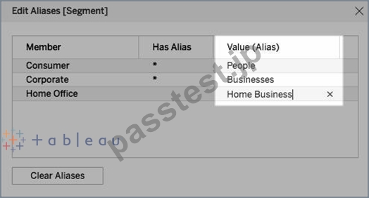
* To submit your changes: In Tableau Desktop, click OK.
On Tableau Server or Tableau Online, click the X icon in the top-right corner of the dialog box.
When you add the field to the view, the alias names appear as labels in the view. For example:
質問 # 86
......
学習材料は有効なTDS-C01効率的問題集:https://www.passtest.jp/Tableau/TDS-C01-shiken.html
最新Tableau Desktop Specialist TDS-C01実際の無料試験解答:https://drive.google.com/open?id=1zmqHflix2TtXt22jTW7dkI5NA_WkNxRW