![]()
[2024年最新] リアルなTableau問題集を使って 100%無料TDA-C01試験問題集
リアルTDA-C01問題集で最新のTableau練習テスト問題集
Tableau TDA-C01(Tableau Certified Data Analyst)認定試験は、主要なデータ視覚化およびビジネスインテリジェンスソフトウェア会社であるTableauが提供する専門的な認定です。この認定は、Tableauデスクトップを使用してデータを分析し、ビジネスの意思決定をサポートする視覚化を作成する習熟度を実証したい個人向けに設計されています。この試験は、データアナリスト、ビジネスアナリスト、およびデータを使用してビジネス洞察を推進する他の専門家を対象としています。
Tableau TDA-C01認定は、Tableauを使用したデータ分析と視覚化の専門知識のベンチマークとして広く認識されており、さまざまな業界の雇用主によって高く評価されています。この認定は、データアナリストが仲間と差別化し、Tableauを使用して複雑なデータセットを視覚化および分析する習熟度を実証するのに役立ちます。また、自分の専門的なスキルと知識を検証および強化し、データ分析の最新のトレンドとベストプラクティスを最新の状態に保つ優れた方法です。
質問 # 69
You create the following story that contains two story point.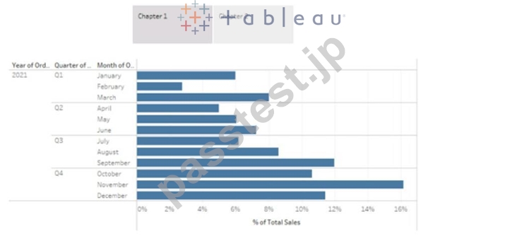
You want to change the story point format to show the current story point number out of the total number of story points.
Which Layout option should you use?
- A. Arrows only
- B. Caption boxes
- C. Numbers
- D. Dots
正解:C
解説:
To change the story point format to show the current story point number out of the total number of story points, you should use the Numbers option in the Layout tab. This option will display the story points as numbers in a horizontal or vertical sequence, such as 1/2, 2/2. You can also choose to show or hide the next and previous arrows for navigation. The Numbers option will help you indicate the progress and order of your story points more clearly than the other options. References:
Creating a Story - Tableau
New in 9.0: Formatting the Story Points Navigator - Tableau
Tableau Certified Data Analyst Study Guide
質問 # 70
You have the following visualization.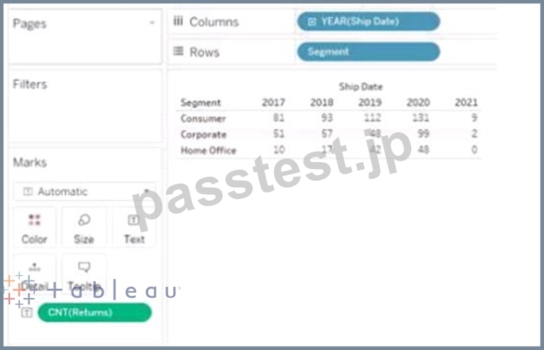
正解:
解説:
質問 # 71
From Tableau Desktop you sign in lo a Tableau Server site.
What appears in the list of available data sources when you search for a published data source?
- A. All the data sources published to the site
- B. All the data sources published to the site within the folders to which you have access
- C. All the data sources published to the Tableau Server within the folders to which you have access
- D. All the data sources published to the Tableau Server
正解:B
解説:
When you sign in to a Tableau Server site from Tableau Desktop and search for a published data source, you will see all the data sources published to the site within the folders to which you have access. You will not see data sources published to other sites or folders that you do not have permission to view. You can also filter your search by project, owner, or tag. Reference: https://help.tableau.com/current/pro/desktop/en-us/connect_basic.htm https://help.tableau.com/current/pro/desktop/en-us/connect_tableauserver.htm
質問 # 72
You have the following chart that shows the cumulative of sales from various dates.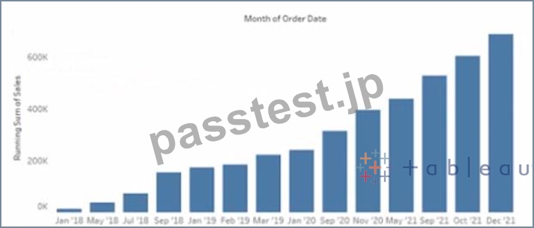
You want the months to appear as shown in the following chart.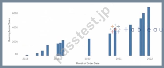
What should you do?
- A. Convert the date to Continuous
- B. Convert the date to Attribute
- C. Convert the date to Exact Date
- D. Select Show Misting Values for the dale
正解:A
解説:
To make the months appear as shown in the second chart, you need to convert the date to Continuous. A continuous date is a green pill that shows a range of values on an axis. A discrete date is a blue pill that shows individual values as headers. In this case, you want to show a continuous range of months on the x-axis, instead of discrete headers.
To convert the date to Continuous, you need to do the following steps:
Right-click on the date field on the Columns shelf and select Convert to Continuous from the menu. This will change the date pill from blue to green and show a continuous range of dates on the x-axis.
Right-click on the date field again and select Month (January 2017) from the menu. This will change the level of detail of the date to month and year, instead of day.
Optionally, you can format the date axis by right-clicking on it and selecting Format from the menu. You can change the scale, tick marks, labels, and other options.
The other options are not correct for this scenario. Converting the date to Exact Date will show every single date as a header, which will be too crowded and unreadable. Selecting Show Missing Values for the date will fill in any gaps in the data with null values, but it will not change how the months appear. Converting the date to Attribute will return only one value for each partition of data, which will not show any variation over time. Reference: https://help.tableau.com/current/pro/desktop/en-us/dates.htm https://help.tableau.com/current/pro/desktop/en-us/dates_continuous.htm https://help.tableau.com/current/pro/desktop/en-us/formatting.htm
質問 # 73
You have the following chart that shows the cumulative of sales from various dates.
You want the months to appear as shown in the following chart.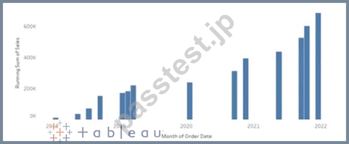
What should you do?
- A. Convert the date to Continuous
- B. Convert the date to Attribute
- C. Convert the date to Exact Date
- D. Select Show Misting Values for the dale
正解:A
質問 # 74
You have the following two tables.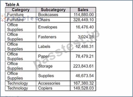
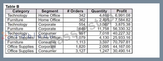
Table A is the primary table.
Which type of join is established when a blend is created by using the join key of Category?
- A. Outer join
- B. Inner join
- C. Right join
- D. Left join
正解:D
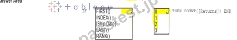
質問 # 75
You have the following dataset.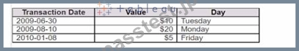
You need to generate the results in the Day field.
How should you complete the formula? (Use the dropdowns in the Answer Area to select the correct options to complete the formula.)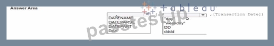
正解:
解説:
質問 # 76
You company has two divisions located in the United States and Germany Bach division has a separate database. The following is a sample of the sales data for the division in the United States.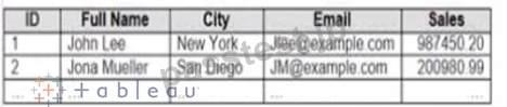
The following is a sample of the sales data for me division in Germany.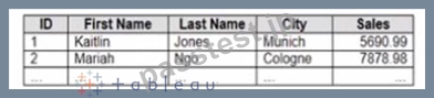
You have population data in a file named Populatio.csv. the following is a sample of the data.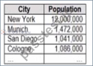
You plan to create a visualization that ml show tie sales per capita for each salesperson Each salesperson must be identified by identified by their full name.
You need to prepare the data to support the planned visualization. The data source must support being published .
Which four actions should you perform in order?
(Place the four correct options n order Use the arrows to move Options to Answer Area arrows to re-order the options.
Use Answer Area arrows to re-order the options)
正解:
解説:
1 - Open Tableau Prep
2 - Create a new column to concatenate the name for the Germany division
3 - Union the sales data of both divisions
4 - Join the sales data and the population data by using Country as the join field
質問 # 77
You have the Mowing dashboard.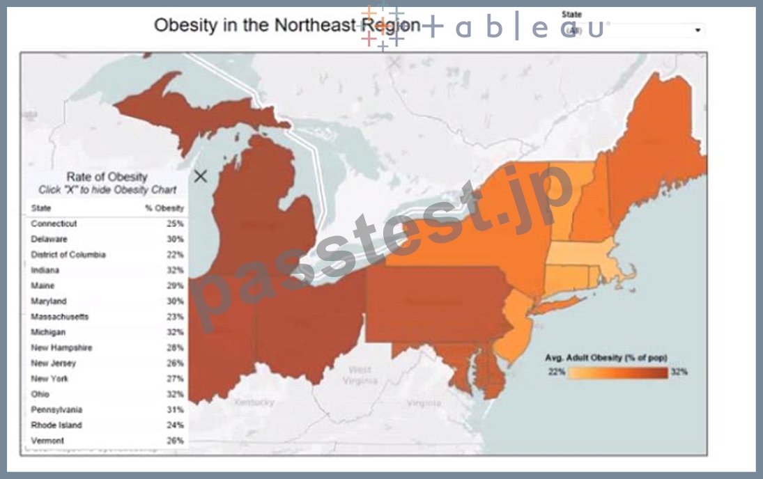
Which two elements are floating? Choose two.
- A. The color legend
- B. The map
- C. The little
- D. The state filter
- E. The Rate of Obesity chart
正解:B、E
質問 # 78
Open the link to Book1 found on the desktop. Open the sales dashboard.
Add the Sales by State sheet in a Show/Hide button to the right side of the dashboard.
正解:
解説:
check the steps below in explanation
Explanation:
To add the Sales by State sheet in a Show/Hide button to the right side of the dashboard, you need to do the following steps:
Open the link to Book1 found on the desktop. This will open the Tableau workbook that contains the sales dashboard.
Click on the sales dashboard tab at the bottom of the workbook to open the dashboard. You will see a dashboard that shows various charts and filters related to sales data.
Drag Sales by State from the Sheets pane to the right side of the dashboard. This will add the sheet as a floating element on the dashboard. You can resize and position it as you like.
Right-click on Sales by State and select Add Show/Hide Button from the menu. This will add a button that allows you to show or hide the sheet on the dashboard. You can customize the appearance and behavior of the button by clicking on it and using the options on the Marks card.
Optionally, you can drag a vertical layout container from the Objects pane to the right side of the dashboard and place Sales by State and its button inside it. This will help you organize your dashboard elements and align them neatly.
質問 # 79
Open the link to Book1 found on the desktop. Open the sales dashboard.
Add the Sales by State sheet in a Show/Hide button to the right side of the dashboard.
- A. check the steps below in explanation
正解:A
解説:
To add the Sales by State sheet in a Show/Hide button to the right side of the dashboard, you need to do the following steps:
Open the link to Book1 found on the desktop. This will open the Tableau workbook that contains the sales dashboard.
Click on the sales dashboard tab at the bottom of the workbook to open the dashboard. You will see a dashboard that shows various charts and filters related to sales data.
Drag Sales by State from the Sheets pane to the right side of the dashboard. This will add the sheet as a floating element on the dashboard. You can resize and position it as you like.
Right-click on Sales by State and select Add Show/Hide Button from the menu. This will add a button that allows you to show or hide the sheet on the dashboard. You can customize the appearance and behavior of the button by clicking on it and using the options on the Marks card.
Optionally, you can drag a vertical layout container from the Objects pane to the right side of the dashboard and place Sales by State and its button inside it. This will help you organize your dashboard elements and align them neatly.
質問 # 80
You plan to publish a workbook to Tableau Server.
You want to ensure that users can see other published dashboards from their current dashboard.
Which setting should you configure? (Click the appropriate Option in the Answer Area.)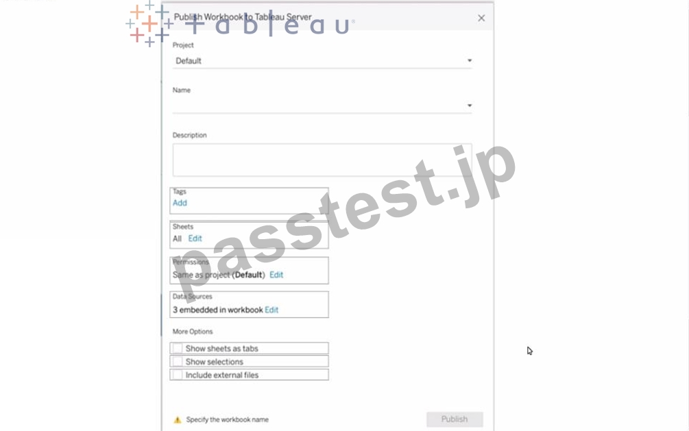
正解:
解説: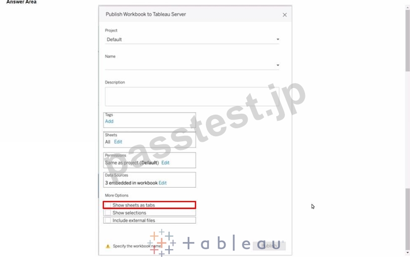
質問 # 81
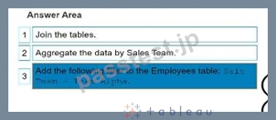
You are developing a data source in Tableau Prep.
You have two tables named Orders and Employees.
The Orders table was created in 2019 and contains the following columns.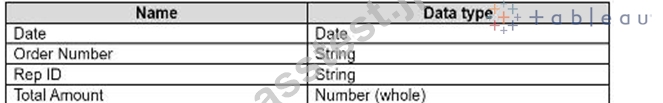
The Employees table contains all the employee information for the various sales teams in the sales department and contains the following columns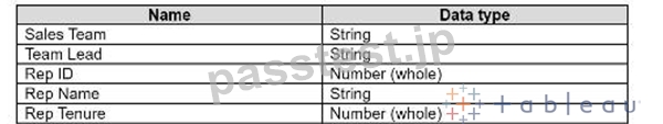
You want to prepare the data so that you can analyze sales trends over time for every sales team.
Which three actions should you perform in order? (Place the three correct options in order. Use the arrows to move Options to Answer Are a. Use Answer Area arrows to re-order the options.)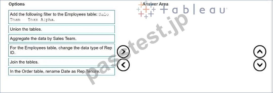
正解:
解説: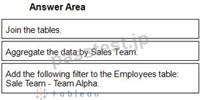
1 - Join the tables.
2 - Aggregate the data by Sales Team.
3 - Add the following filter to the Employees table: Sale Team - Team Alpha.
Reference:
[Tableau Certified Data Analyst Exam Prep Guide], page 9, section "Preparing Data"
[Tableau Help: Join Your Data]
[Tableau Help: Aggregate Your Data]
[Tableau Help: Filter Your Data]
質問 # 82
You create a parameter named Choose Region fiat contains values from a field named Region.
You want users to be able to use the Choose Region parameter to interact with a chart by logging between different regions What should you do next?
- A. Set the Choose Region parameter to Single Value (list)
- B. Add Region to me Fitters card
- C. Add the [Region] = [choose Region) formula to the Filters card
- D. Add the Choose Region parameter to the Pages card
正解:B
質問 # 83
Open the Link to Book1 found on the desktop. Open Map worksheet and use Superstore data source.
Create a filed map to show the distribution of total Sales by State across the United States.
- A. Send us your feedback on it.
- B. Send us your
正解:A
質問 # 84
You have the following: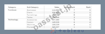
Overall Rank and Rank are calculated fields that use the RANK function.
You filter out the sub-category where [Ovorall Rank] - 1.
For which three the sub-categories will the value of Rank change? Choose three.
- A. Tables
- B. Copiers
- C. Bookcases
- D. Accessories
- E. Machines
G Phones - F. Chairs
- G. Furnishings
正解:A、D、E
解説:
In Tableau, the RANK function assigns a rank to each row within a partition of the data, based on the value of the field being ranked. It is important to understand that the rank is recalculated whenever the underlying data or the partitioning changes.
In the given scenario, the Overall Rank is based on the Sales figures, while the Rank (presumably) is based on the Sales within the Category. When filtering on the condition where [Overall Rank] - 1, it means we are excluding the sub-category that has an Overall Rank of 2.
Looking at the data:
Furnishings has an Overall Rank of 8, which does not meet the filter condition ([Overall Rank] - 1).
Therefore, its rank remains the same.
Tables have an Overall Rank of 3. When the sub-category with an Overall Rank of 2 is removed (Chairs in this case), Tables move up in the overall ranking. However, since Tables are the top-ranked within the Furniture category, their Rank within the category would remain unchanged at 1.
Chairs have an Overall Rank of 2, which meets the filter condition and thus will be removed from the view. We cannot determine the change in Rank for Chairs because they are filtered out.
Accessories have an Overall Rank of 5. If any sub-category with a higher Overall Rank (1 to 4) is removed, the rank of Accessories within the Technology category could change because it is currently ranked 3 in its category. With the removal of Phones (Overall Rank 1), the Rank of Accessories could potentially increase.
Copiers have an Overall Rank of 6, which does not meet the filter condition. Therefore, its rank remains the same.
Machines have an Overall Rank of 4. If we remove Phones (Overall Rank 1), Machines will move up in the overall ranking and potentially within the Technology category as well, changing its Rank from 2 to
1.
Phones have an Overall Rank of 1, which does not meet the filter condition of being Overall Rank 2.
Therefore, its rank remains the same.
Bookcases have an Overall Rank of 7, which does not meet the filter condition. Therefore, its rank remains the same.
Based on this analysis, when the sub-category with an Overall Rank of 2 (Chairs) is removed, the Rank value will change for Tables, Accessories, and Machines, as they will move up in the overall ranking within their respective categories. However, it's important to note that while Tables will move up in the overall ranking, their rank within the Furniture category would not change as they are already at the top. The rank changes for Accessories and Machines are due to the removal of Phones, which is ranked higher overall and within the Technology category.
質問 # 85
You have the following line chart that shows the average sales by month.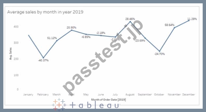
Which month had the biggest increase in swage sales compared to me previous month in 2019?
- A. December
- B. November
- C. August
- D. October
正解:B
解説:
Based on the line chart provided, each point on the line chart represents the average sales for a given month, and the percentage values indicate the change in average sales compared to the previous month. The month of November shows a significant increase from the month of October, indicated by a large upward spike on the chart and a high percentage increase.
質問 # 86
......
Tableau TDA-C01は、データ分析のスキルと知識を向上させたい個人向けに設計された認定試験です。この認定は、Tableauスキルと知識を検証したいデータアナリストに最適です。この試験に合格することで、個人のTableauを使用した様々なデータソースへの接続、データ分析の実行、視覚化の作成と共有、およびダッシュボードの設計能力が証明されます。
TDA-C01問題集PDFでTDA-C01リアルな試験問題アンサー:https://www.passtest.jp/Tableau/TDA-C01-shiken.html
TDA-C01試験 [2024年最新] 問題集でTableauのPDF問題:https://drive.google.com/open?id=1CrqEjAC4m480cKam5Ru-i9ny3aEiD2W9